Contextualized Observability
Hot take: numbers are meaningless. Even meaningful numbers are meaningless—on their own.
Here, I’ll show you. Take this number: 1 light year. Is it big or small? It depends, of course. If it is a distance to travel, it’s huge! It will have taken Voyager 1 nearly fifty years to travel the distance when it reaches one light year from Earth in 2026. However, on the scale of the universe (and even on smaller scales, like the local cluster) one light year is microscopically tiny.
I was surprised to learn of this number’s meaninglessness: speed. If you’re anything like me, you probably didn’t think of speed as relative, let alone meaningless. But, on inspection, it becomes obvious that it is a relative term. Without something to relate to, it is meaningless. If I am going fifty miles per hour, the question is: relative to what? Previously, when I thought of speed, I unconsciously thought of it relative to something in a fixed position on the surface of the Earth. But, if that assumption no longer holds (for example, in space travel), it is immediately apparent that speed is relative. You need to establish a new reference point for speed to become meaningful again.
This is a common, basic fact that data analysts understand and that marketers know how to abuse. Those who don’t understand this concept are open to manipulation. Those who understand it can glean meaningful insights from the numbers in their life.
This post isn’t about space travel or marketing. It’s about software engineering and observability. However, the underlying concepts apply to pretty much any place you’re graphing numbers.
Observability
I’ve been focusing on the observability, reliability, and resiliency of the systems that I am responsible for at The New York Times. These include systems that choose which messages and offers are displayed to readers.
Like many others, I’m looking to reduce cloud costs, increase performance, and understand the causes of errors and latency. So, I’m constantly evolving my custom observability dashboards.
Many dashboards I run across display the raw numbers of various metrics. They show the total number of running instances, total number of errors, or p99 latency. While this isn’t harmful, it also isn’t always helpful. Because they display the raw numbers, I have to spend additional time interpreting each widget on the dashboard. Is this p99 high? Is this instance count acceptable? Should I drop my work and investigate these errors? Without context, I don’t know.
Adding Context
I’d like to show a few examples where I added context to graphs in my dashboards. You’ll see how the additional context reveals something meaningful about the metric.
Replica Count
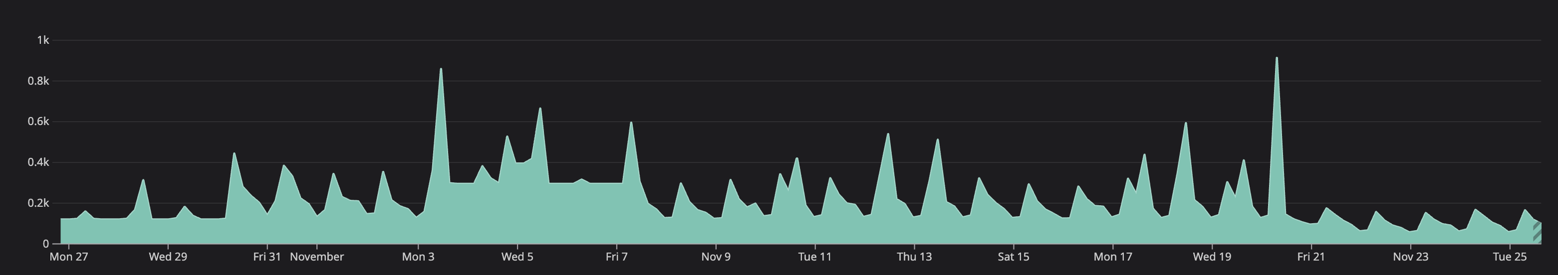
One of the problems with monitoring user-facing systems is that their usage is not totally predictable. Particularly at The Times, our traffic ebbs and flows with reader behavior.
So, when I look at replica count alone, I don’t get anything meaningful. Is the system running more instances because I merged unoptimized code or is traffic simply going up? I couldn’t answer that question with only raw replica count.
Here’s what it looked like at first: raw replica count.
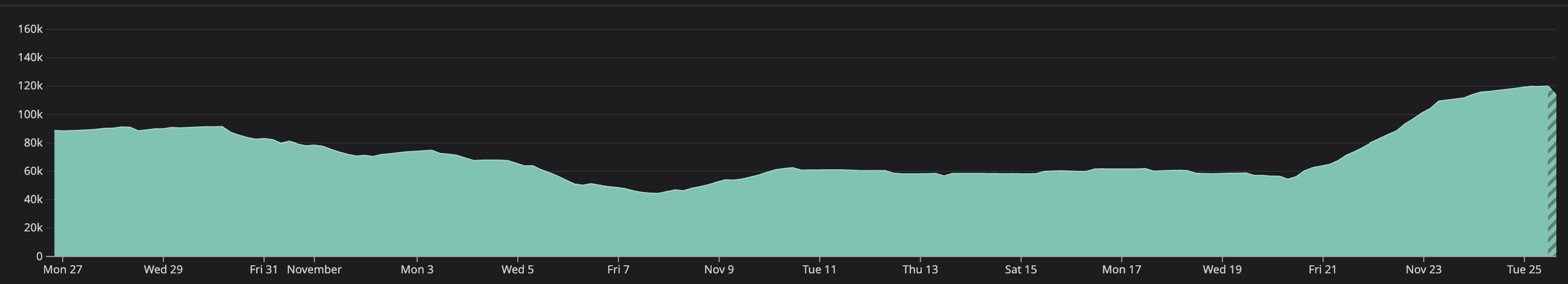
I couldn’t use this to determine why replica counts were increasing or decreasing. So, I added a new view: requests per replica count. Now, I was able to see something meaningful. Sometime around October 30th, requests per replica count decreased. Still, it wasn’t quite detailed enough to pinpoint the issue.
I wanted to know if the change happened naturally or if it coincided with a release. Next, I updated the graph to show requests per replica count by version. This shows a clear step-change in requests per replica count resulting from a specific version. Hovering over that version allowed me to see the exact version causing the regression.
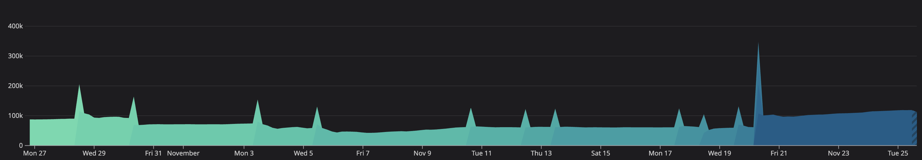
As you can see, I was able to launch a fix (and even an overall improvement) on Friday 11/21. Contextualized observability allowed me to understand where to look, enabling me to fix the issue.
Errors
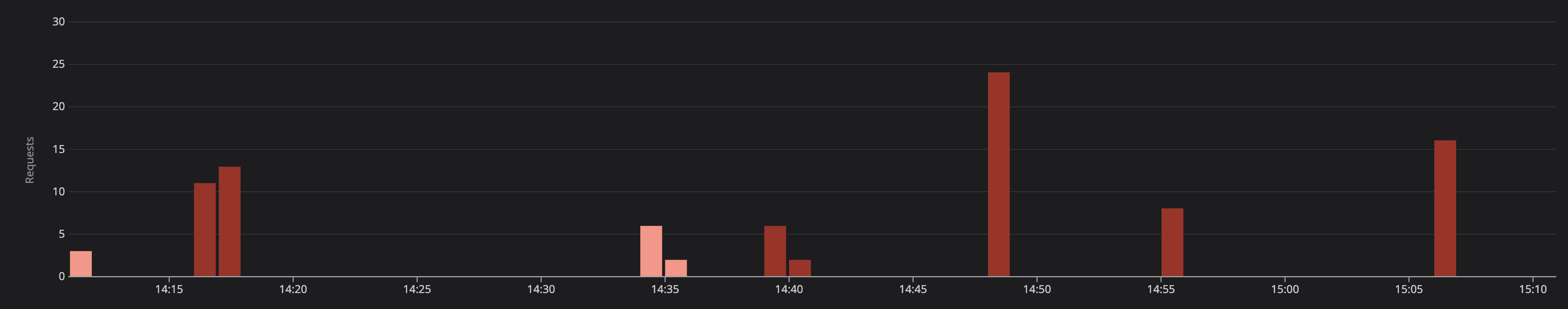
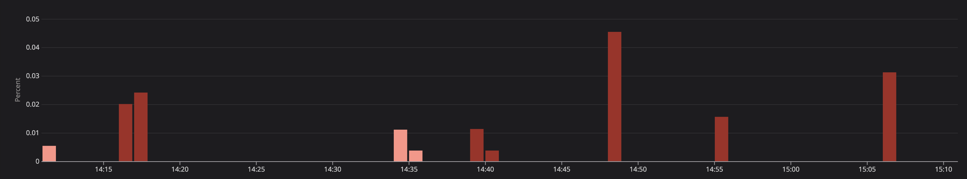
Here’s another example: errors. Can you tell me if these errors are problematic or not?
You can’t. Not without more information. We have no idea if these account for 100% or 0.01% of all requests. We have no idea what threshold constitutes a problem vs. acceptable rate.
So, to answer this question, we need more context.
I began by updating the display to show errors as a percentage of total requests. Now, we can see that this is only a fraction of a percent of overall requests. Still, we don’t know if these are problematic. If this is a critical system requiring 99.99% or even 99.999% uptime, we could be breaching our SLOs.
Finally, I added a contextual marker showing the system’s SLO. Now, we can determine at a glance if these errors are acceptable or not. This doesn’t mean they aren’t worth looking into. However, it does help us understand the severity of the situation.
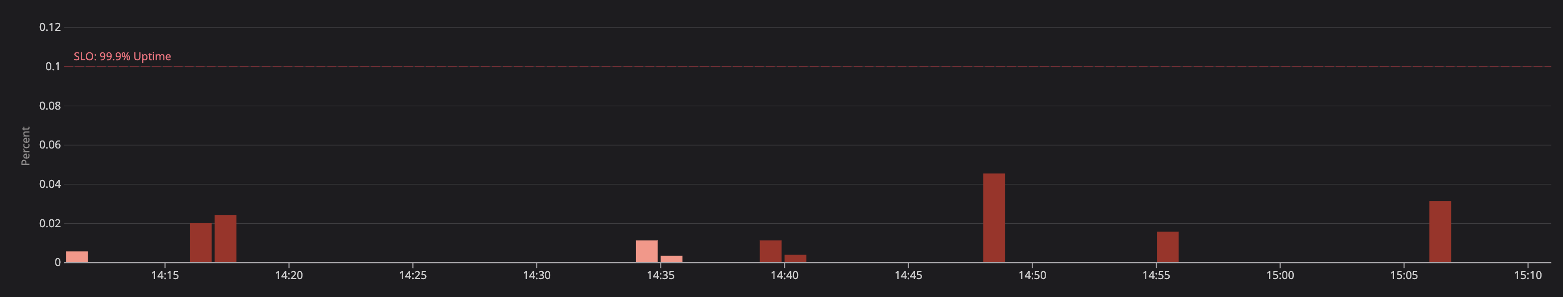
Notice in all three graphs that the spikes all look the same. Without context, those scary red spikes could cause an on-call engineer to go down a rabbit hole. If a degradation is happening, it could waste critical minutes—increasing time to resolution. It could also lead an engineer to believe there is a degradation when there is not.
Caveats
Now, I am not claiming that you should totally replace raw numbers on all of your visualizations. Over time, those raw numbers may have obtained meaning to you. For example, you may have memorized the typical number of instances. Any deviation would become meaningful to you.
Instead, you may choose to combine raw numbers and contextualized numbers. You could choose to display them on the same chart or side-by-side.
In other cases, raw numbers may sneakily appear to have meaning on their own. For example, if you have a fixed number of nodes, the raw number could appear meaningful. But notice, it is only that limit that makes the raw number meaningful. In this case, it would be good to display the limit as a marker wherever you display the raw count.